Below is my promotional video and a link to my journal.

Sunday, 23 February 2014
Tuesday, 10 December 2013


More prints...
This week I have done a few drawings because I needed them. I also collected more photographs and began to create prints.

Saturday, 7 December 2013
Krzysztof Wyzynski
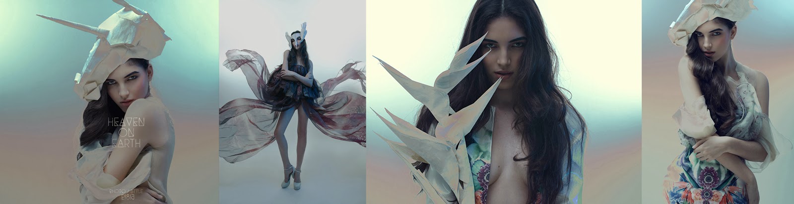
Kryzysztof Wyzynski caught my eye and then I saw this editorial he did for DModa magazine. I really like the way he has edited the photographs and I would like to try out some of the techniques myself.


Ryan McGinley

I find Ryan McGinley inspirational and I like the atmosphere of his photographs, the way he captures the light. My project began by capturing light so I think it would be really good for me to try and incorporate this style into my photographs and zine.

Thursday, 21 November 2013
Lookbook Research
I have researched into how I want my lookbook and photographs to be. My cookbook will mainly be about the photos. I do want to add text but keep it minimal. I took my photos before doing my research which in he insight was a bad idea.



Monday, 11 November 2013
Thinking ahead...
This week i have been thinking more about collections. I definitely want a collection that can be for screen printing with a limited colour palette as its a good skill to have and could increase my chances of getting a job in the future. Below are some initial ideas for that collection.

Another collection I am interested in doing is layer and lines. I like the look of the broken up prints and plan to break them up further with the use of panelling.

The collection below is some photography with drawings and painting. I really like the mood of the collection. I have exaggerated the black and white elements of each print which makes it stand apart from my other more colourful collections. I would also like to create a photography based collection to show some of my best photographs as I feel they are strong enough to stand on their own.

The collection below has a pastel feel to it. I plan to try and move it forwards this week by toning down some of the prints.

Friday, 8 November 2013
Essay Week
This week I have mainly been concentrating on my extended essay as I prefer to do things in blocks as opposed to re-visiting something once a week. After a talk with my tutor we decided that it was best that I leave the boutique for unit X but continue to create relevant samples in this project as you can see below. This meant my live project would have to change. I am doing a placement in a school but would also like to gain experience in industry as I feel this will increase my chances of getting a job. I've applied for an internship at Jane Carr which I feel would be really beneficial as its accessories and this is what I want to go into.


Jane Carr, (2012), The Costume Square (ice) [ONLINE]. Available at: http://jane-carr.com/product/the-costume-square/942/ice/495/ [Accessed 08 November 13].
Wednesday, 30 October 2013
Boutique
This week I have been researching into starting up an asos boutique as my live project. I will not be able to apply for the boutique until all the products are ready to be photographed for sale. This includes having final prints.
I plan to sell clutch bags, digitally printed scarves, canvas bags and head scarves. I have experience in making scarves from second year.
I have began to research into clutch bags as this is unknown territory for me. These straps are coming onto the catwalks for autumn/winter 2014/2015 as seen by Jil Sander and Gabriele Colansela. and they are something that I would like to incorporate into my design if possible.

Transparent clothing and accessories are in all year for 2014 so this is something that I am interested in looking into. Burberry, Phillip Lim, Lacoste and Dries Van Noten have all got them in their 2014 collections. I could possibly make transparent clutches.

Wednesday, 23 October 2013

Thursday, 17 October 2013
Colour
I first concentrated on gathering colourful photographs and making them look more man made with filters. Some of these photos I think will stand strong as prints on their own.
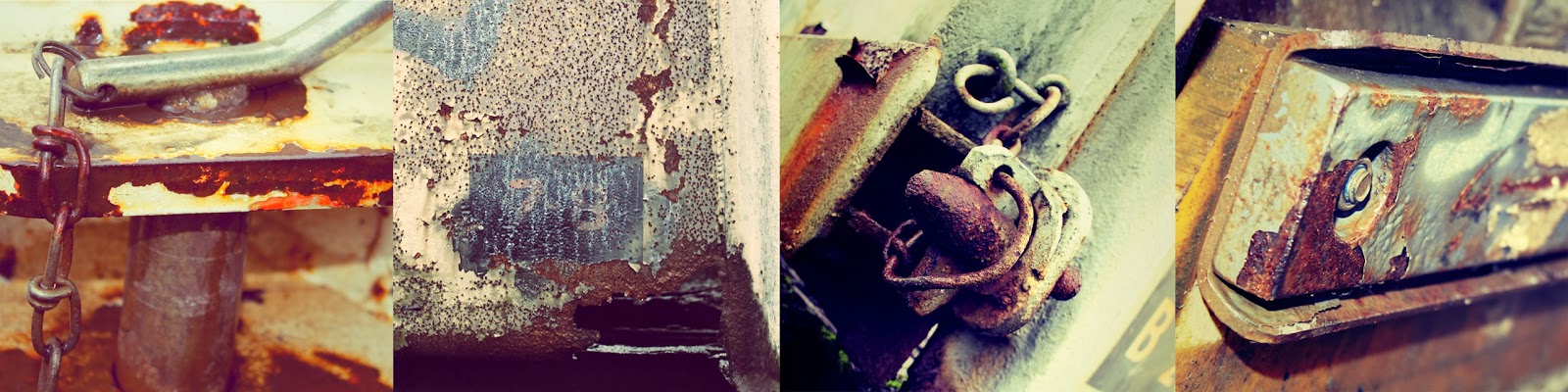
 I then wanted to capture the complete opposite of pretty flowers so I went to an old train grave yard. It was perfect.
 While I was experimenting on photoshop as a complete mistake I came across this layer effect where one image starts and the other begins but I really like it and its really relevant as I am also interested in creating layers with materials in my final pieces.


Wednesday, 9 October 2013
Drawing Week
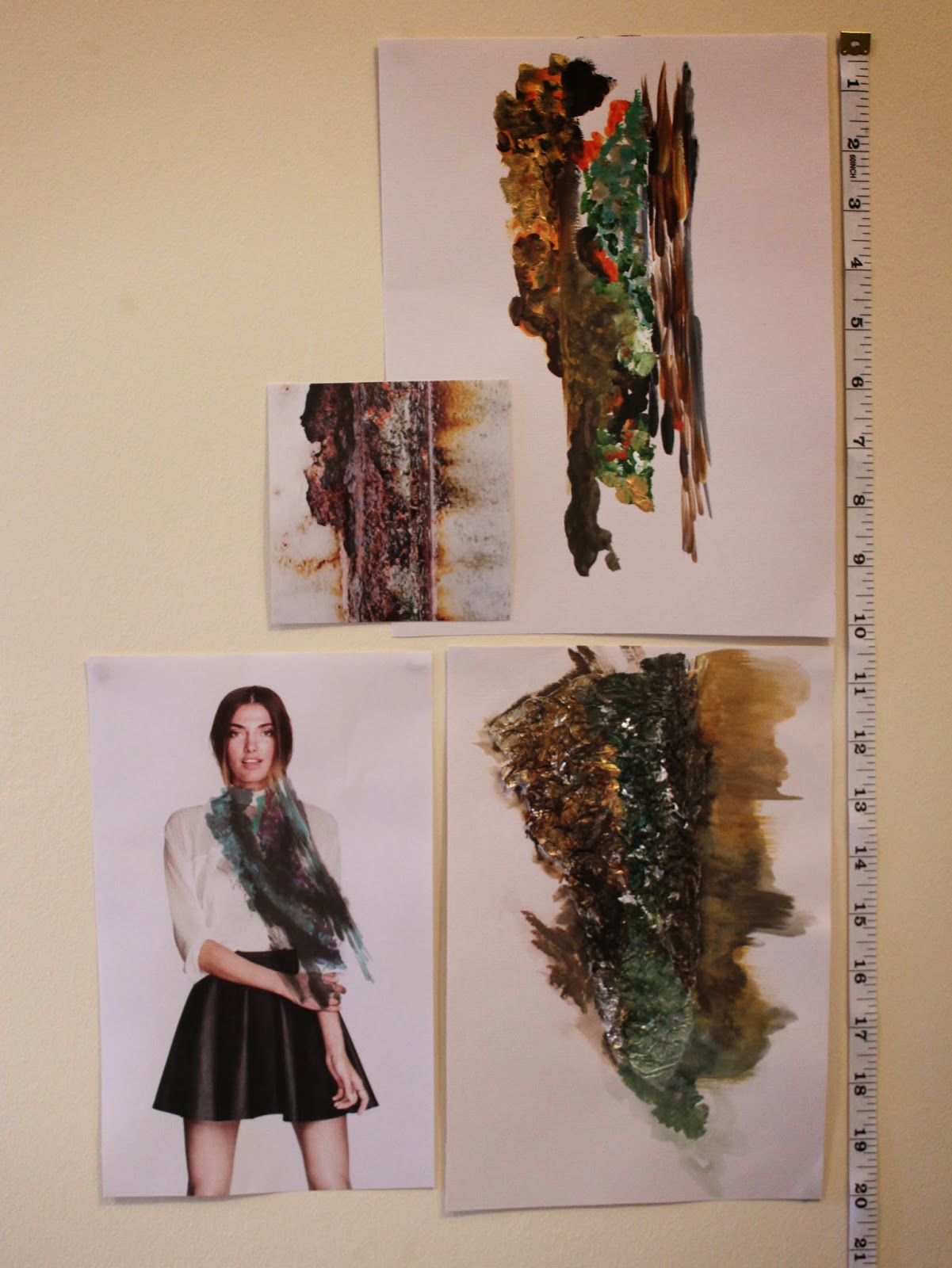
This week I dedicated my time to creating more drawings and paintings and collecting more photographs. I tried to stay away from mark making as in the past I have only done this and really struggled for imagery so I concentrated on drawing and painting whole objects. It was hard to get into at first as I feel this is a weakness of mine, however, as the week went on it became much easier and quicker. Below are just a couple of things I have created this week


This week has been really beneficial and given me time to think in depth about my project and the things I would like to explore within it. When I look back at my drawings I am drawn to natural things so next week I plan to visit a forest and get photos of fungi and a scrapyard as I think I will be able to get photographs of machinery and decaying meta textures etc. From these photographs I will be able to do some mark making and this is something I really enjoy. I also plan to capture traffic at night as I am still really interested in movement of light.
Wednesday, 2 October 2013
Development
This week I have been creating print ideas with the drawings, paintings and photographs I have so far.


I am happy with the ideas I have so far however in he insight I started creating prints too soon. I do not have enough, photographs, drawings, paintings, research or ideas. To combat this I will spend the next 2 weeks soley taking photos and drawing from them. I will develop the prints I have created at a later date.
Wednesday, 25 September 2013
Opposites
I began going out taking photographs of things that interested me. I was drawn to light, colour and texture. Soon my project really started to take shape and appeared to have a direction. I began to experiment with the exposure settings on my camera and got some really stunning and interesting results as you can see below.


All of my images were either really delicate natural things like flowers or really robust man made things like rides and machinery this is where I came up with the title Natural Vs. Man made.
Wednesday, 11 September 2013
Starting Point
I began going out taking photographs of things that interested me. I was drawn to light, colour and texture. Soon my project really started to take shape and appeared to have a direction. I began to experiment with the exposure settings on my camera and got some really stunning and interesting results as you can see below.
All of my images were either really delicate natural things like flowers or really robust man made things like rides and machinery this is where I came up with the title opposites.
Wednesday, 15 May 2013
Evaluation
During Unit X I have learnt many things about myself and the way in which I work. I can identify how to improve my work; I can take advice for improvement and always respond positively; I am developing my knowledge and the application of that knowledge to present my work to suit a particular clients’ need; and I am learning to analyse, and evaluate my work.
At the beginning of this project I was torn between whether I wanted to design prints for interiors or fashion. Nonetheless, I chose the Dianne Harrison brief as the titles within it sounded the most interesting and inspiring.
Working from a live brief was something new for me; this meant that although it was a project I was being assessed as part of my University Degree course, it ultimately had to meet the needs of an outside client. How exciting; I would be able to see if my textile designs were innovative and unique enough to meet the very competitive design industries’ high standards.
Initially, I was unsure of what the client, Dianne Harrison wanted. I normally work from photographs that I have set up, taken myself and then layered with a few hand drawn images in Photoshop. I had chosen the ‘Exploration’ section of the brief and after some research decided to make it more concise and just concentrate on ‘The Exploration of the Sea’. My first thought was to visit some aquariums to get primary images; although the subsequent photographs are not visible in my end result the visits motivated me further.
The trip to the Dianne Harrison Studio was a real learning curve for me; it changed everything. After seeing their work, I realised that all their designs are hand drawn, without any sign of digital imagery. This meant I had to re-think my normal thought process and plan of action to meet the client’s needs and requirements. - I began gathering more visual research to draw and paint from. Later, when the male Designer from Dianne Harrison Studio visited my university, he suggested I try more transparent media like tracing paper. I took his advice and after experimentation on: tracing paper, paper and acetate I finally came across clear film – it is really thin acetate on a roll. I knew immediately that this gave the ‘sea effect’ I was looking for; I loved the way the ink dried in such a fluid way. I began building a collection of ink paintings on clear film to scan and use digitally. I was pleased as I had succeeded in coming up with a new idea to get the effect I wanted and had linked together what I had learnt from the whole ‘Dianne Harrison experience’ with my independent experimentation. I had learnt new processes and had to try different ways of working, but had taken the professional advice and seen it through to completion. I adapted my experimentation accordingly to reach a successful outcome.
At present, all my designs are for bedding. Despite drawing my inspiration from ‘The Exploration of the Sea’, the Dianne Harrison review only confirmed what I was already beginning to realise that bedding with inhabitants from the sea would not appeal to the market. The man from Dianne Harrison could not understand why I was painting jellyfish and underwater creatures for bedding because it would not sell. I knew then that I had to try and just take the massive range of colours, textures and patterns forward.
In this project, I have learnt there are many benefits to creating prints for interiors; high selling prices amongst them, as opposed to prints for fashion which sell for far less. Despite this, I think I enjoy designing prints for fashion more; I find it less constraining and more versatile. Interiors on the other hand, often involve repeat pattern and although this gives me a sense of achievement as they are a good deal more technically challenging to produce than a one-off fashion print, I do not feel as inspired by them; nor do I feel as proud of the end result.
Unit X is all about interdisciplinary collaboration. I enjoyed working as a group in the first section of the project but I was disappointed there wasn't another opportunity to work as a group. Sometime in the near future I would like to create group work to give me more of a sense of what its like to work in a design team.
Unit X is all about interdisciplinary collaboration. I enjoyed working as a group in the first section of the project but I was disappointed there wasn't another opportunity to work as a group. Sometime in the near future I would like to create group work to give me more of a sense of what its like to work in a design team.
Generally, my time management was quite good throughout this project, I never leave things until the last minute; however I am a slow starter and work better under pressure. I do not give up easily and will always persevere with a challenge in my designs, even when the going is slow and tough. If I think it will work, I will persevere until I can get it as good as the time allows.
I think my contextual research could have been stronger, I should have more extensively researched bedding; I could have looked at Marks and Spencers, Sandersons, Dot Mason etc. I could of also done more artist research and this may have influenced my end results. Overall, I am happy with the majority of my designs. If I had more time, I would resolve a few of my designs. When I printed my designs off to scale a couple of them were pixelated and had too much white space, but it was too late to rectify at this late stage. Although I was not happy with a couple of the to scale prints, I was happy with them in their visualisation, so they would probably work well when printed on fabric.
If I were to start again, I would ensure that I am sticking to the design standards of printing (for example 200cm x 200cm for bedding); I would also make sure my repeats were 8x8 or a multiple of that, to stop myself from having to edit or re-produce designs in the late stages of the project.
I have really enjoyed being a part of this project, the experiences and knowledge I have gained are invaluable; I am excited at the thought of receiving feedback from Dianne Harrison to see what they think of my designs. Whatever, the feedback I shall take any form of constructive criticism on board as it will maximise my potential in the design industry. This experience has given me a real insight in to how a real successful design company works.
Below are my flat visualisations which show both the full print and to give a sense of the scale of the print.


Monday, 13 May 2013
Fabrics, Scale and Displacement.
I always like to print my designs onto fabric to test the colour and to see which designs I should take forward. Below are some photographs of the tester prints. I found doing this really useful as I have now made any colour changes to the designs that I need to. Some of the designs when printed onto the fabric became washed out, so I made the colours more intense on Photoshop to prevent this from happening again. I am mostly pleased with the way they turned out however, I think the top and middle prints on the right are too busy for the collection.
Once I had decided which prints I wanted to take forward I began working on my displacements. When I printed the fabric samples I had not considered scale and putting my designs onto a bed will help me visualise what scale is best for each design. Below are two displacements showing the scale I opted for with those specific prints. The top one is smaller scale and the two underneath are a larger scale scale. I am really glad I did these displacements as they made my decision on scale easier. They would also help potential buyers in the design world visualise what my prints would look like.

Once I had decided which prints I wanted to take forward I began working on my displacements. When I printed the fabric samples I had not considered scale and putting my designs onto a bed will help me visualise what scale is best for each design. Below are two displacements showing the scale I opted for with those specific prints. The top one is smaller scale and the two underneath are a larger scale scale. I am really glad I did these displacements as they made my decision on scale easier. They would also help potential buyers in the design world visualise what my prints would look like.


Subscribe to:
Posts (Atom)